Experiments in Photoshop
Or doing the same thing over and over and getting different results.
Photoshop and I have, shall we say, a strained relationship. While I stand amazed at the power the program grants for manipulating images, the program itself, with its seemingly infinite settings and options, is not my favorite. Needless to say, I approached this image assignment with some fear and trepidation. And many times during these experiments I approached the verge of insanity, saved only by the fact that, despite seeming to do the same things, I got different, and sometimes even better, results. In the end, I leave you to judge the successfulness of my encounter with Photoshop.
First, some context. For this assignment, we were asked to attempt the following:
- a cropped and resized image
- a matted engraving
- a restored photograph
- a hand-colored photograph
- a vignetted photograph
Matted Engraving, Cropped, and Resized
I began my experiment with the matted engraving, using the Paula Petrik's tutorial. I thought, perhaps, it might be a easier entry into using photoshop. As you shall see, my image choice made this introduction quite problematic.
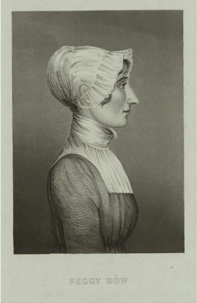
Portrait of Peggy Dow, wife of the itinerant preacher Lorenzo Dow. Image from the New York Public Library. Original is available here.
This is the first image I chose to use for the matting assignment. It is a portrait of Peggy Dow, wife of Lorenzo Dow and author, who has been largely forgotten in the historical narrative (I am working on fixing that, never fear!). This is the main image that exists of her, and I thought it would be nice to remove the background, as it rather detracts from this simple image and would focus more attention on Peggy herself. This, however, proved challenging with the methods described in the tutorial because the background is neither darker nor lighter than the image of Peggy. Instead, it is right in the mid-range. So, all attempts to blend and remove the extraneous colors were in vain. (Please don't ask me how often I tried. It is embarrassing.)
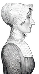
Peggy rematted.
And so, while this is likely not the most efficient method, I instead resorted to using the lasso tools to roughly cut out Peggy and copied her onto a white background. Because of the similarity between Peggy and her background, the magnetic lasso tool proved less than helpful - the difference between the pixels was not significant enough.
Instead, I used the polygonal lasso to make the first cut and then erased the offending grey background. Part of me wonders if the quick selection or magic wand tools could have been used, but I have only been able to select either odd sections or the whole image when using them. In the end, after much erasing, I was left with this clean and beautiful image of Mrs. Dow.
I did, however, want to make use of the Petrik method (just to say I did), and so I found another image for that purpose.
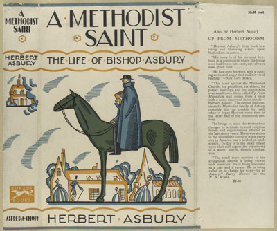
Dust Jacket for Herbert Asbury's biography of Francis Asbury. Image from the New York Public Library. Original is available here.
This is a dust jacket from Herbert Asbury's biography of Francis Asbury, one of the first bishop of the Methodist Episcopal Church. The cover dates to 1927 and has wonderfully yellowed over time. This made it an excellent candidate for the Petrik method.
To salvage this image, I first engaged in cropping, isolating out the center image of a stylized Asbury on his horse, the emblem of the itinerant preacher extraordinaire that he was. (Note also the adoring, and somewhat oddly placed, parishioners in the background.) Next, using the blending tool, I removed the majority of the yellowing, and with a few erasing touches, dissolved the yellow forever. Finally, just because, I slightly adjusted the colors to enrich and enliven them and then saved for the web. By the end of my machinations, I had a decent image that could be used in contexts far removed from the book cover.
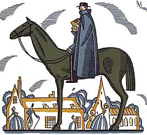
Here the main image of Bishop Asbury has been selected from the dust jacket and the background coloring removed.
Image Restored
And now. The Main Event.
After cutting my teeth on the matting assignment, I moved on to photo restoration. This was a grand struggle, both in choosing an image to devote hours of attention to and in the process of fixing said image. In the end, I decided to work on an image from my own past: an image of my great grandparents, taken around the time of their marriage. It is a wonderful image, full of challenging damaged corners, dust and scratches, and color decay.
First, for maximum impact, here is the photograph of my great grandparents, before and after the restoration work.
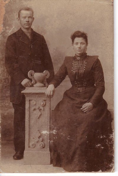
Original portrait of my great-grandparents, Jan van den Akker and Popkje Haisma, taken around the time of their marriage in 1902.
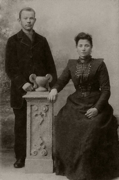
Restored portrait of Jan van den Akker and Popkje Haisma, 1902.
All I have to say is that because my understanding of Photoshop is still rather limited, this took a long time.
I approached this image with the goal of working systematically (something I don't do very well by default) and working from the most extreme damage to the more detailed work.
The first steps I took were to crop and begin with some general fixes to the image. I used the auto adjust functions to give a rough edit to the image (I am undecided about the usefulness of those auto functions) and removed the white "border" from the scanning of the image. This original image was a high resolution tiff that was scanned in color, so there was a lot of information in the image file to work with. The automatic functions moved the image into black-and-white (though with an odd bluish tinge) but did little to lessen the amount of work I needed to do manually on the image.
I began the intensive restoration work by addressing the peeling in the upper-left corner and the folding of the upper-right corner. For this I used a combination of the clone stamp tool and the healing brush tools. However, I found on my first attempt that the tan color of the backing was causing confusion for the tools. So, I first had to modify the color of the backing, making it more closely match the rest of the background, and then I had better success. Fortunately, this corner of the background seemed to be a background image of very blurry trees, and so detail was not overly important. The upper right corner was easily handled by the healing brush.
The next challenge I addressed was the removal of the areas of white, where the photograph appears to be scratched, and the general (and very prevalent) dust residue. I wanted to use the "dust and scratch" filter, but read online that it was better to get rid of the more egregious flaws manually first. So I went through the image carefully and tediously, using a lot of the healing brush tool (which I learned works best when you make it big enough so that it has enough information and small enough so that you don't end up with smudges everywhere) and also using the clone tool to repair some of the larger damaged sections. I fixed some of the flaws along the edges with strategic cropping and healing brush tools. This time of systematic and painstaking work went on for some time, and I will spare you the details, mainly because I have forgotten them at this point. Or blocked them … much too painful.
After fixing as much of the scratch damage as I could, I turned my attention to adjusting the colors. This involved playing with curves, with the white and black settings, and other adjustment options as I attempted to find the best point to work from. Increasing the contrast was the most effective. With more contrast, more of the details to come through and some of the discoloration in the darker colors of my great-grandparents' clothing lessened. I also used the burn tool to bring the dress and pants into a more consistent darkness. I also had great fun using the burn tool to remove that unsightly shine from my great-grandfather's forehead. Finally, I used the burn tool to increase the detail on their faces and used the dodge tool to manually lighten (and fade) the background in a last attempt to remove some of the noise in the image and direct attention to the subject of the image. (I attempted to use the noise reducing filters, but found them too broad. Probably should have isolated out the people and just applied it to the background. I will try that next time.)
Over all, I think I was able to make the greatest improvements to the image of my great-grandfather. His face, in particular, is visible in the restore photograph, where much of the detail is lost in the original. While I keep finding additional errors or slips of the burn brush, I am generally quite happy with how the restoration turned out.
Image Colorized, Cropped, and Resized
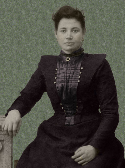
From the restored image, I cropped out the image of my great-grandmother and added color.
Taking the now restored image, I decided to focus on my great-grandmother, Popkje, for the colorizing section of the assignment. I decided to remove her from her background. I made this much harder for myself than I needed to, as I cut her out and then manually erased the unwanted details because I had trouble controlling the magnetic lasso tool.
Once I had separated her from her environment, I set about to make her beautiful. I started with the flesh tones. This I did using very low opacity and flow settings and by systematically applying color in small circles. I did her hair similarly, which I think allowed me to avoid the toupee look I was getting with the Man with Cat
image from class.
For her eyes, I attempted a different method. I used the lasso tools to select them and then used the hue and saturation
adjustments to turn them from grey to green. This method worked quite well and was how I also added the color to her dress.
In the dress application, using the hue and saturation
adjustment layer was very beneficial, because once the area of the dress was selected, I could enter the values I had decided on and could rest assured that each segment of the dress was the same. I choose the burgundy color because, during the restoration process, the dress kept seeming to take a reddish tone. In addition, as this is a celebratory dress, I chose to stay away from browns, and the color remaining in the image made blues and greens seem unlikely. While I am not confident in the accuracy of my choice, it seemed appropriate to the image as I worked with it. When working on the blouse I noticed the colorize
option in the "Hue and Saturation" panel. That setting allowed me to retain its silky look. I also added color to the jewelry and the few background pieces I retained (so that her arm wouldn't float in space).
Image Vignetted, Cropped, and Resized
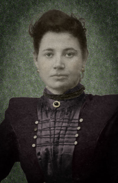
Finally, I took the colored image and added a vignette effect.
The final element of the assignment was adding a vignette effect. Using a method that Megan found a tutorial for and suggested, I chose to go with a dark vignette effect, rather than a light effect. This seemed appropriate to me given that the image is a portrait and, vignetted this way, felt as though it could be appropriated framed (if desired). I also tightened the cropping yet again, to focus the image on her face and the details of her dress.
Over all, I think the restoration and colorization of the image went well. And I think that it will be easier next time, since I picked up a couple tricks by working with the program. I am sure my approach to restoring the images took quite a bit longer and was more involved than it needed to be because of my limited knowledge of the program. But, the end goal was achieved and it was rewarding to spend the time to bring a family portrait back to life.